The Brief
Personalise and revamp the onboarding journey for the new LBG customer. Make sure we avoid duplicating customers by identifying them early in the process.
The bank is changing their strategy around PCAS and need a way for users to customise their account once open.
The Goal
Make the user experience of the onboarding journey for new and existing customers easy to understand and as short as possible.
The Challenges
We had to work within the constrictions of an old system where we were able to change the front end but we were unable to completely change the existing logic. This meant the customer still had to answer the 30+ questions, but if we were successful, not everybody would have to go through it.
The process
We started by mapping out the current journey as well as planning out the alternative goals other users might have. Everybody needed to open an account, but not everybody wants to switch, an overdraft or to register for IB.
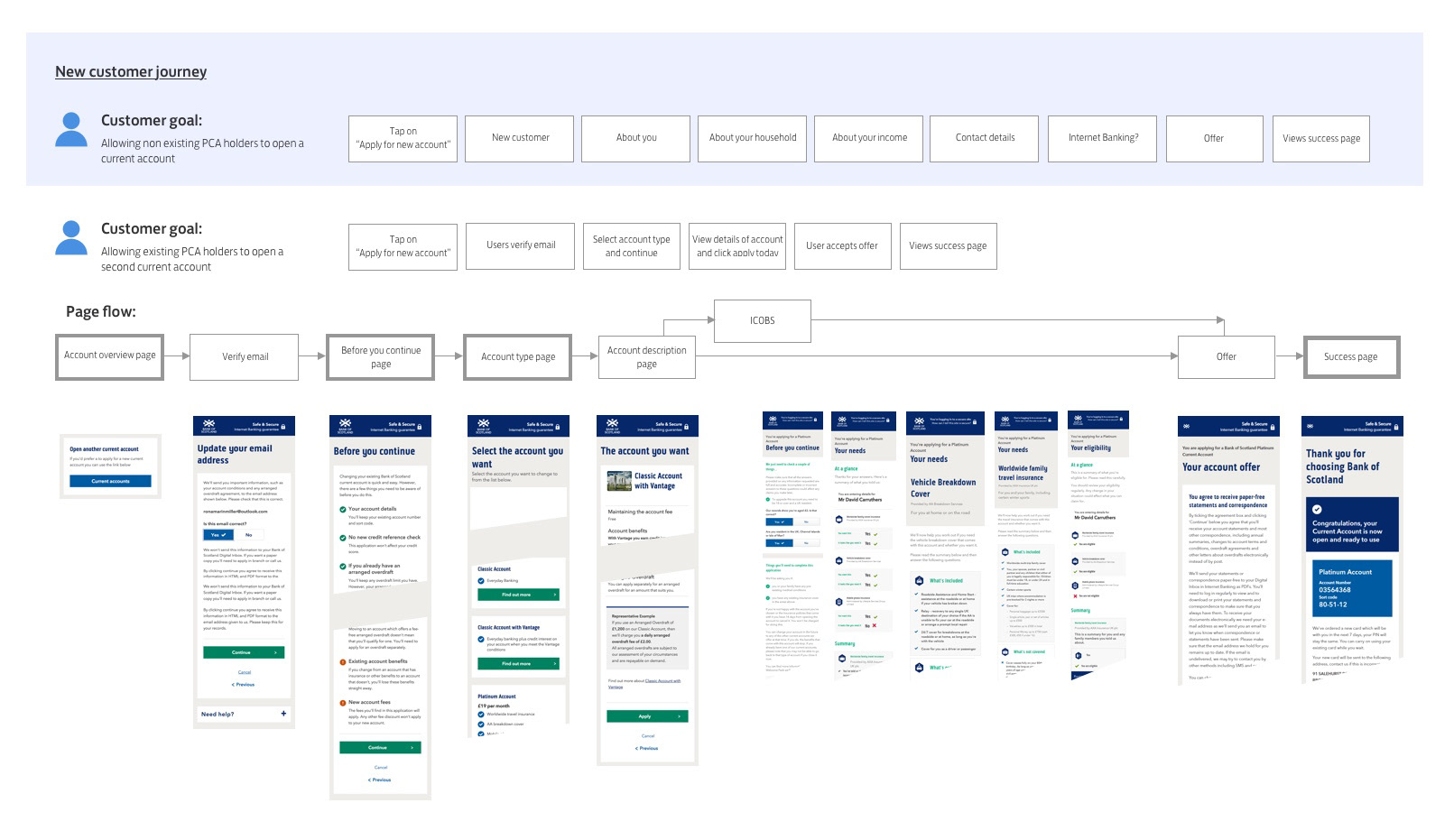
Our first win
The first problem we tackled was duplicated account holders. By adding a couple questions at the start of the journey we avoided these new users having to go through the entire process. The bank was able to identify if they had been a customer in the past or if they hold a product with one of its brands. This meant the bank could retrieve a lot of information on them avoiding the user having to input it and shortening their application.
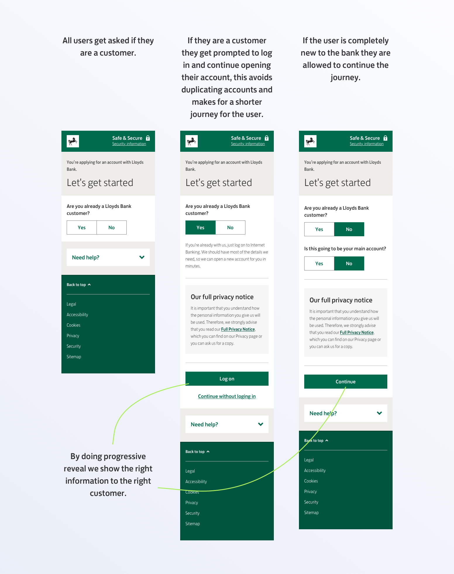
Progressive reveal and getting with the times
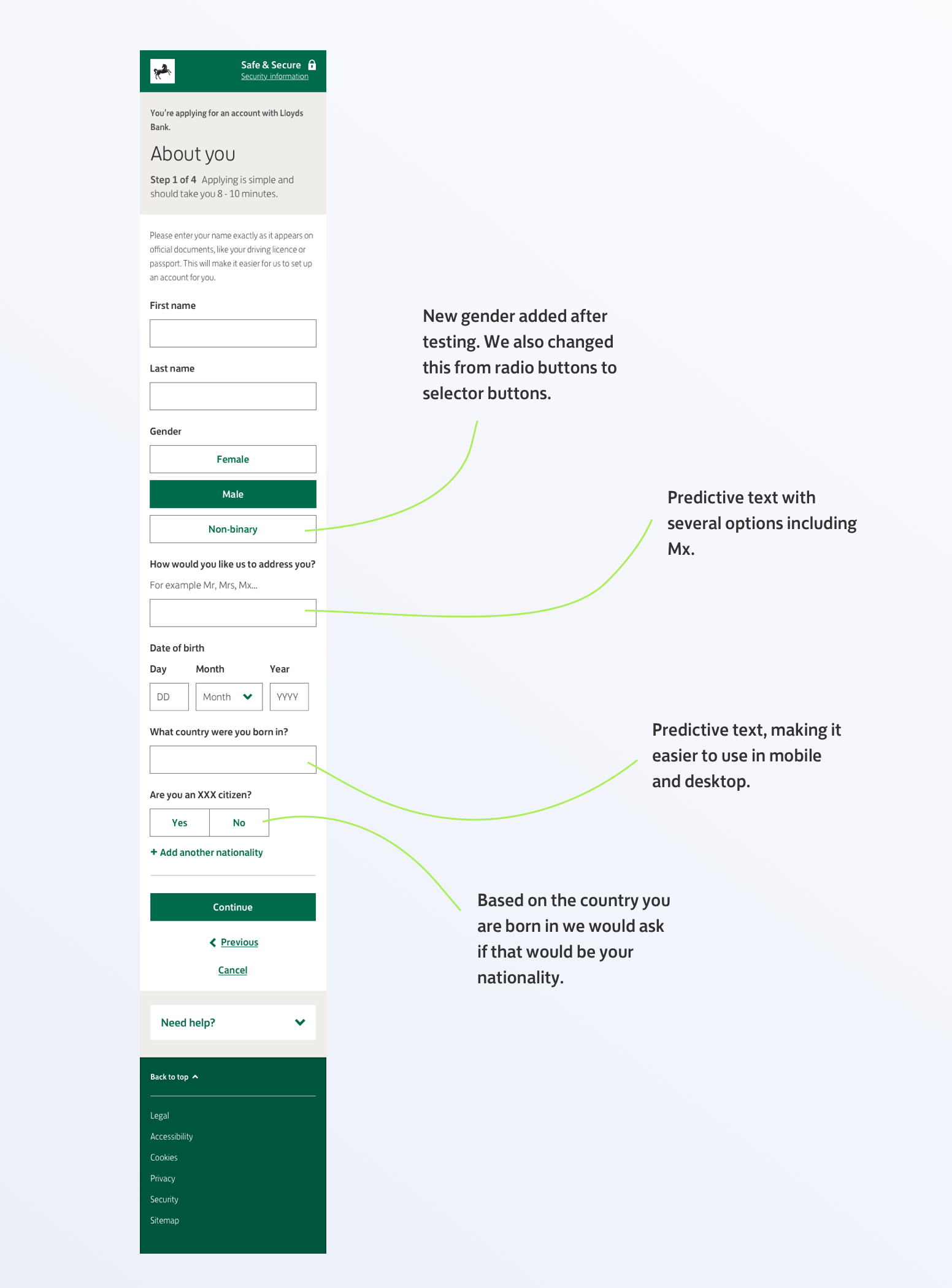
Our next step was to tackle the questions to open up an account. We questioned the need to ask certain details like title, gender and middle name. We managed to remove some fields and add more progressive options to others.
We changed title from a dropdown defaulting on Mr to a predictive text field. We eliminated middle name. The bank only had two options for gender, but we knew that some countries now accept a third option on their passport, so together with Lloyds LGBTQ community we did some testing and added a third option (Non binary)
We did a lot of work around predictive text and changed our fields of Country of birth and Nationality to text fields vs dropdown. This required extensive accessibility testing but we found great results especially with non British people as we added options of nationality in native languages as well as options for British people, if you choose Scottish it would show up as United Kingdom (Scottish), same if you entered England or Welsh.
Designing with mobile in mind
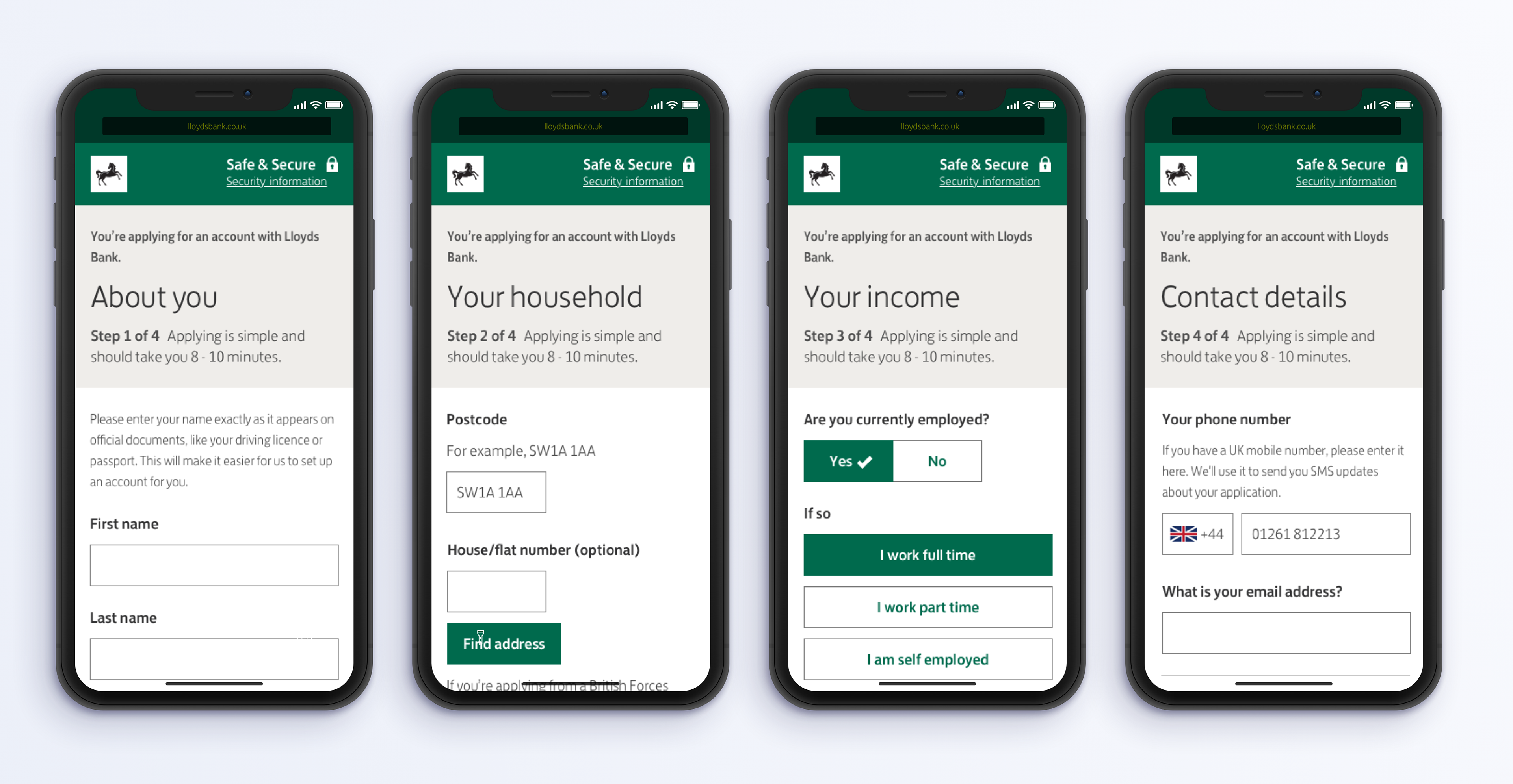
Opening a new account could not be done in the native app. Our growing mobile users had to open an account using the same journey as a desktop user. The current journey felt long and by hiding the information in accordions it was difficult to navigate. This was the main reason we decided to split the journey in to smaller sections.
We divided this in to four pages, easier to digest including a progress step by step.
The end of the journey
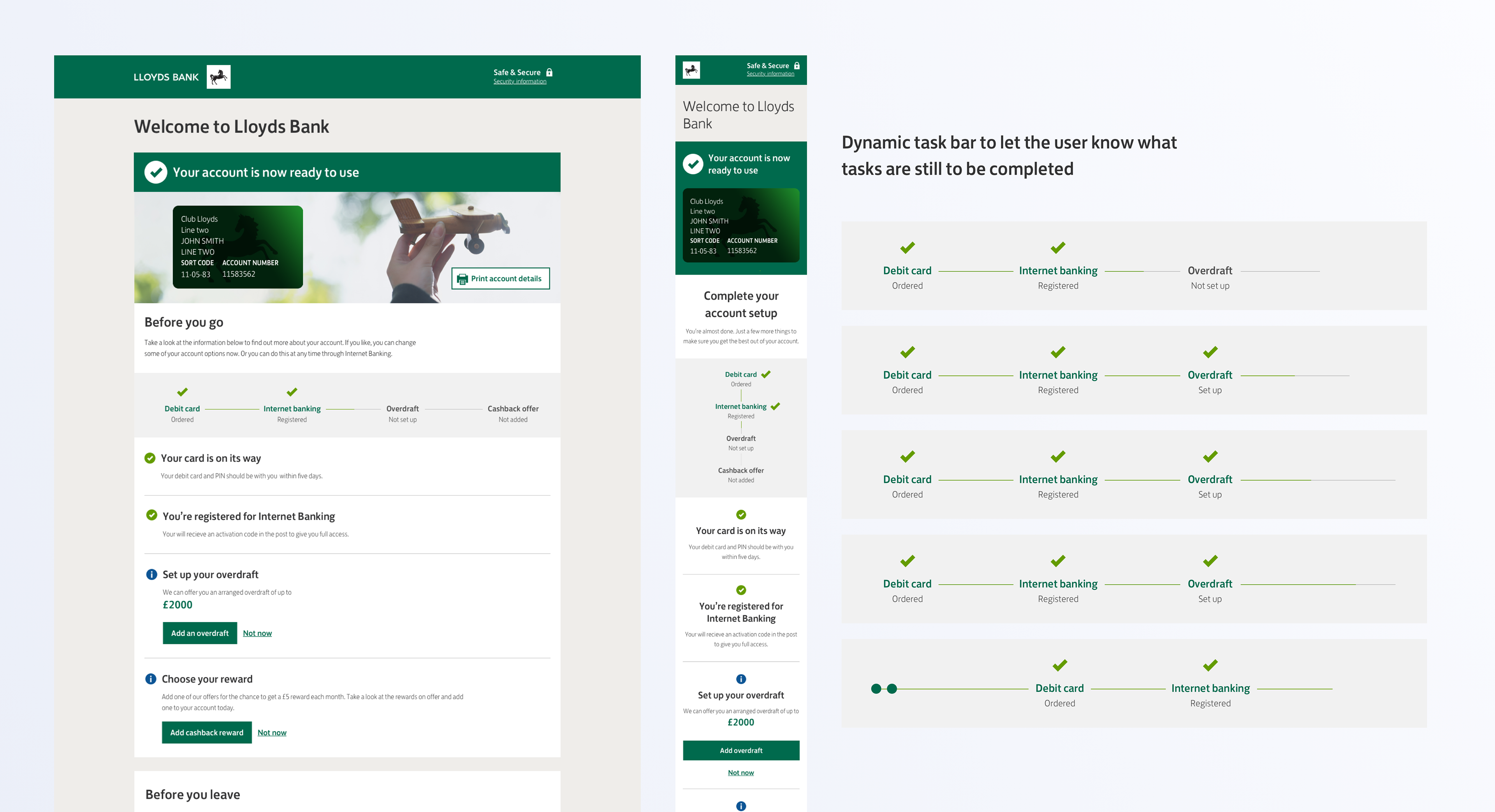
The original success page had grown legs, it had become a dumping ground for extra calls to action and had left users without a clear vision of what to do next or a sense of completion.
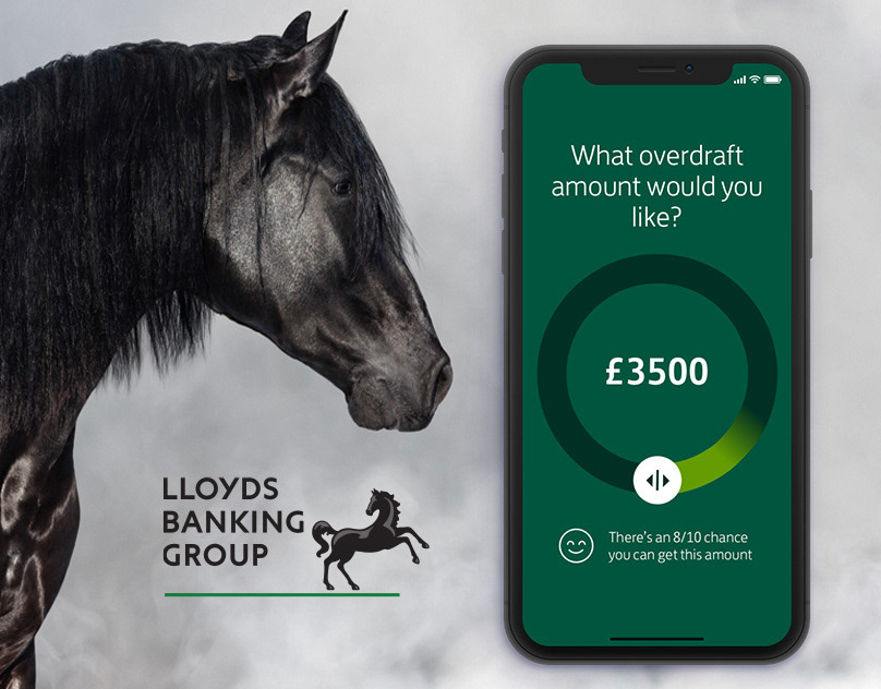
We created a hub to customise your bank account. You can now add an overdraft, add any special offers to your account, select your communication preferences and any other add on that you qualify for would be added here, clearly signposted with a progress bar letting users know what they had accomplished and what they could do next if they wished to.
User testing
We conducted 12 sessions of usability testing of 45 min each. We tested an interactive prototype of the journey created in Axure and Invision. The users flew through the new forms and completely understood the new dynamic of the success page.
The Rising Metropolitans (younger users) were very receptive about the gender and title changes.
The results
The changes are now live! we successfully managed to decrease the amount of dropouts and duplicate accounts in the onboarding journey, its conversion rate outperformed the KPI and the amount of positive feedback we've received.