The problem
Users are concerned about applying for an account if they are unable to get the overdraft they want. There is a new legislation coming in to play that is making banks be more transparent about overdraft costs.
The brief
The business briefed us to create an eligibility checker, the user should be able to check whether they will be able to get an overdraft before they commit to opening an account with the bank and going through a credit check.
The goal
We wanted to create a checker that was as easy to use as possible, that wouldn't need a lot of information from the user and that would minimise the opening of an account if the user decided to make an application after finding out that they were eligible.
It was key for us to make sure the user knew this would not affect their credit score, that they were able to compare overdraft costs within the different accounts that they were eligible for and that was mobile first.
The challenges
We needed a minimum amount of information from the user to be able to predict a likelihood outcome. We were concerned about asking the user for personal information as this was considered a barrier when the user is only shopping around.
The amount that the user could borrow was between £50 and £5000 in increments of £10 making the use of a standard slider in mobile difficult to use.
We did not want to influence the amount of overdraft that the user wanted to get, we were weary of showing them their maximum and wanted to encourage them to only take what they needed.
We were unable to display the costs of all the accounts at once as the bank wanted to minimize costs and each time the user asked for a figure it would cost the bank.
Lloyds, Halifax and BOS all have a Design System and we needed to stick to their existing components to minimise the work needed for MVP.
Our process
After being briefed by the business we went through a discovery phase where we did competitor analysis, followed by creating different options of how we could display the information and how best the user could navigate the journey.
We had two different journey mapped out.
1. User arrives and wants to compare overdraft costs of all of our accounts.
2. User arrives at the site and wants to check if they are eligible for an overdraft.
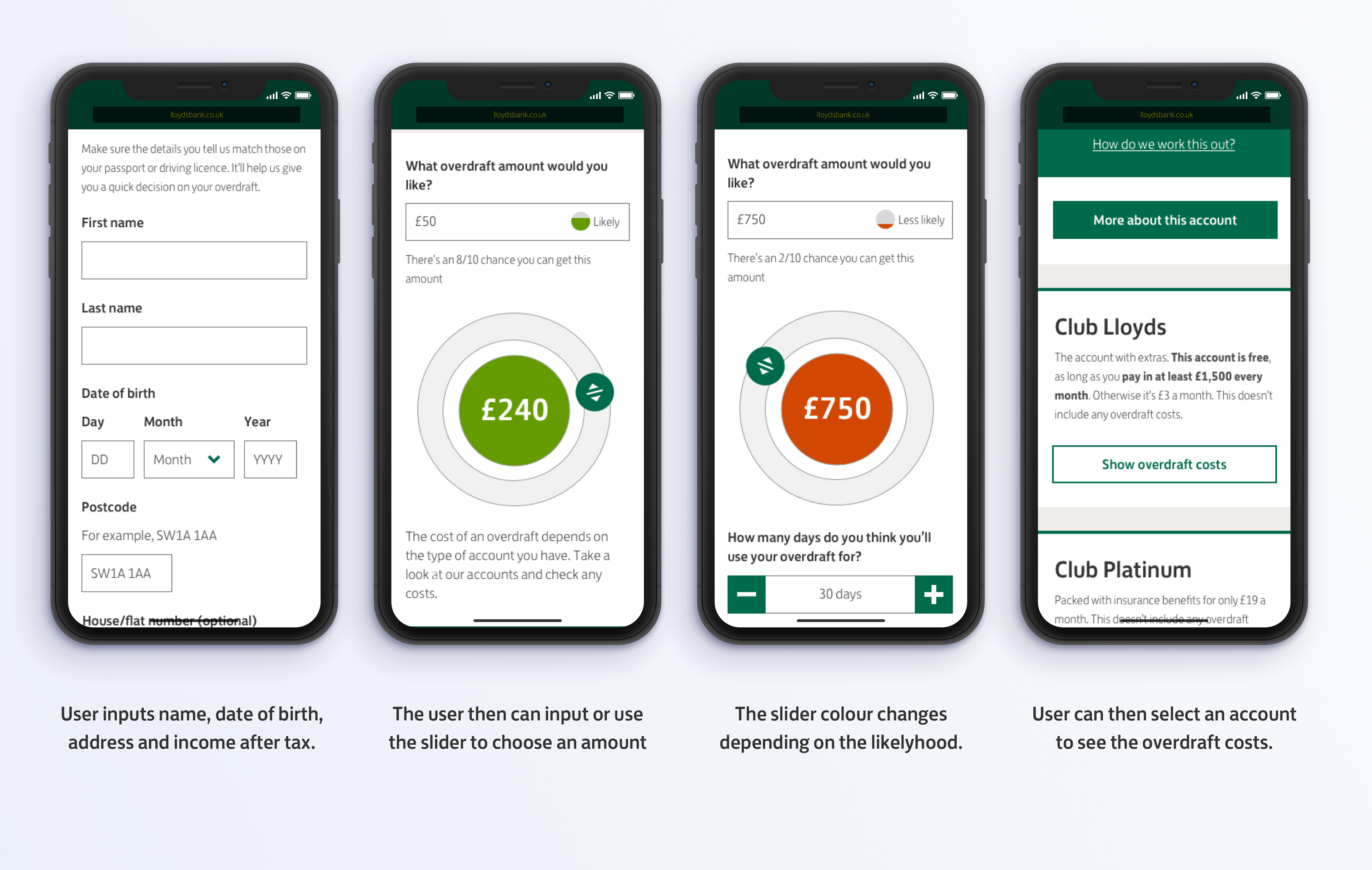
For scenario one the user does not need to give any personal information, they only need to enter an amount they want to borrow as well as the time. We kept this journey as simple as possible within the technical constraints.
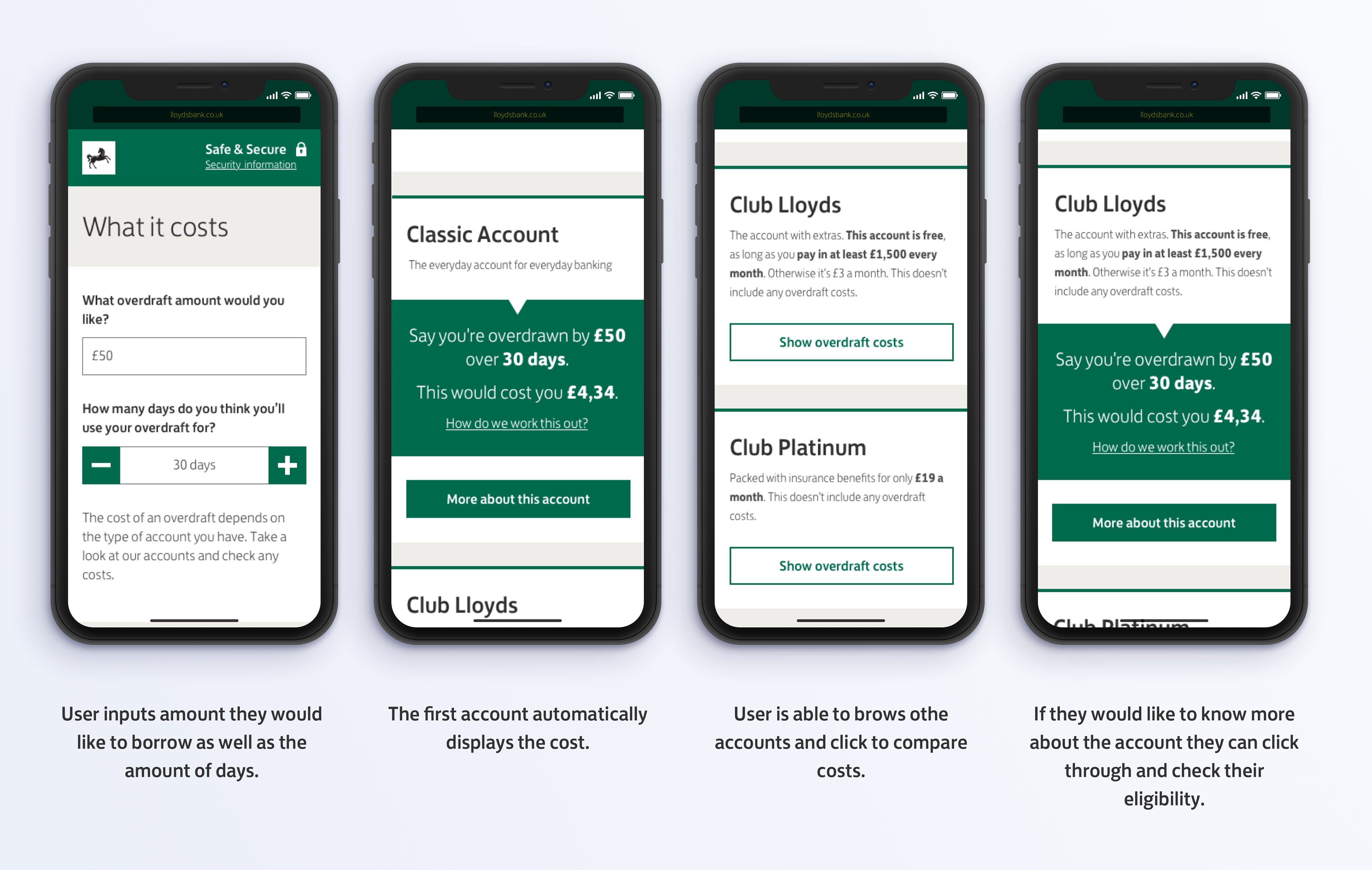
For scenario number two this required the user to input some personal information before getting a decision from the bank if they would be able to get an overdraft. Our original thinking was to show the customer a range of how much they could borrow, from likely to get approved, too unlikely. We played around with different options of sliders to try and improve the current one as it did not work with high amounts. And we tried to combine all this in a way where the user could get as much information at a glance as possible.
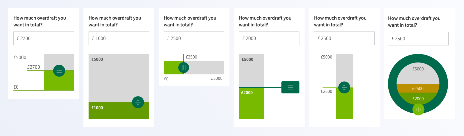
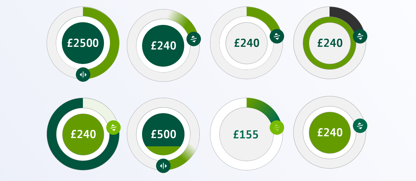
We did competitor analysis in our discovery phase and came up with a variation of sliders for the user to play with in our testing. The circular slider seemed to be the most promising so we decided to include it in our test.
Testing
We user tested our journey as well as the slider and had some interesting feedback.
Regarding our slider there were mixed reactions, a few struggled to use the prototype, it was rough and jumpy while others thought it was easy to use but questioned the purpose.
Most users used the text box when landing on the slider page, we found that younger participants couldn't be bothered with the slider but more elderly liked that it was big and visible.
Our fist version of the slider allowed the user to go round multiple times, each complete circumference was £1000, so if a user wanted £5000 they would have to go round 5 times or enter £5000 in the text box. Users felt out of control "it's like going round in a washing machine" what lead us to push for our recommendation of only doing one round even though this might make the slider more sensitive.
When comparing our slider to the competitors it came on top of other sliders but second to Barclays who only have an input box. Linear sliders were more familiar to our users but when they had such high quantities like £5000 they found them too sensitive and almost impossible to pinpoint an exact figure.
Conclusion
After looking in to the data we discovered that 90% of users were eligible for an overdraft of less than £500, this discovery led us to push for a two rounds on the circular slider as it would be very tricky for users to select an amount that only spans 10% of the slider. Our next steps are to explore an increment version, a slider where the first 50% could equate to the first £1000.
The journeys were simple with not that many steps and the biggest piece of work was the slider. We are currently developing a version two. And we have already started seeing other competitors starting to implement circular sliders (Apple and Argos)