The Brief
It currently takes the bank a long time to release a new product, due to technology constraints within the old system. We were asked by the business to develop the capability to launch new offers for customers in less time, giving the bank the capability to be more reactive to the changing market.
The Goal
Create a Pick & Mix model. The new capability will offer customers more choice that's relevant to them. We create a core product that can be easily customised, this gives us more flexibility allowing the bank to react to changes in customer behaviour. The bank should be able to build and deliver a new product to market in 8 to 10 weeks.
The Challenges
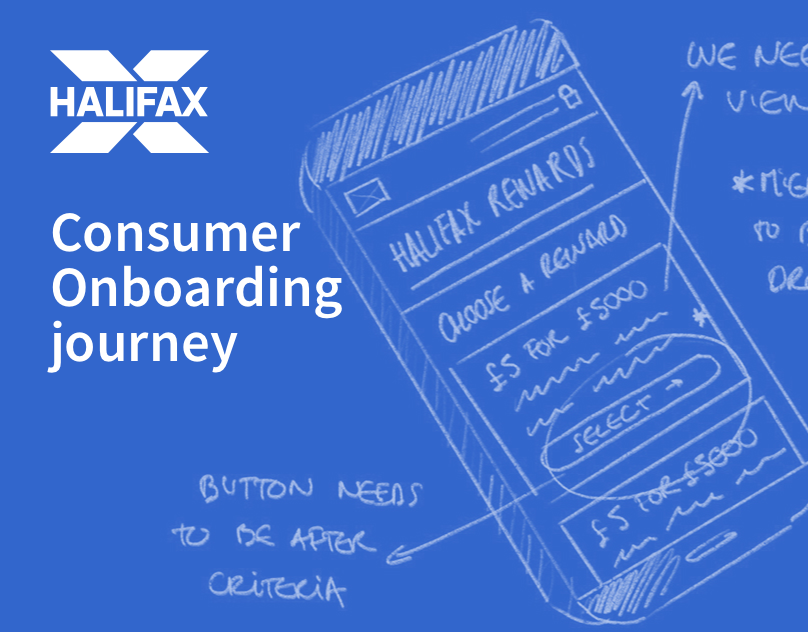
Migrating existing customers to this new pick and mix system was not an easy task. For all new customers this journey was integrated in the success page, but existing customers had to be hand held through the process. We also had one big constrain, the rewards would be linked to the user behaviour, you would only get a reward if you spend £500 or if you save £5000.
And to top it all off Halifax was undergoing a rebrand.
The process
We started off by conducting user surveys to try and identify how people would select their reward. Would they prefer prize first conditions second or other way round?
After having a look at our results it was decided we would proceed with reward first. We followed the hypothesis that people want to know what they can get before they have to put the work in. Once this was decided we started working on the different possible interactions and ways we could display the information.
Less is sometimes more
One of the big challenges was battling it out with Risk and Legal, this project really tested the balance between user needs/delivering an elegant experience and the business wanting to make sure the user was aware of the T&C.
We took Risk and Legals concerns onboard and relied on user testing to win our argument.
User testing
We conducted 6 sessions of usability testing of 45 min each. We tested with Asset rich greys and Rising metropolitans.
We tested an interactive prototype of the journey by asking the users to think like they were Halifax customers and gave them a real life task to perform, while observing them and collecting their feedback.
We asked some users to open an account if they didn't have one, and other users to go through the process of switching to this new proposition.
The results
The feedback was positive for the opt in journey, the participants whizzed through the journey without any difficulty. At the end of the journey all the participants were able to explain what they had done and how the offer they selected worked. They were all able to compare the offers and make an informed decision.
Some points were unclear: the monthly payment cycle (following calendar months instead of opt-in anniversary date) the payment date and offer duration. We are now working to improve these.


